Wawa | Order Kiosk UX Case Study
As the UX Designer for this project, I led the end-to-end redesign of Wawa’s in-store ordering kiosk. The goal was to streamline the experience—making it faster, more intuitive, and easier to navigate. Through user research, and a reimagined information architecture, I introduced interface updates that aligned with Wawa’s brand and improved the overall user journey from start to checkout.
The Opportunity
Wawa’s kiosks play a key role in serving customers efficiently and accurately, helping drive order volume while maintaining quality. They also create an opportunity to build customer loyalty and increase sales through strategic upselling and cross-selling.
This redesign focused on answering four key questions:
What problems are users currently facing?
Who benefits most from using the kiosk?
What value does the kiosk deliver today?
How can we expand on that value to improve the user experience?
Early Insights
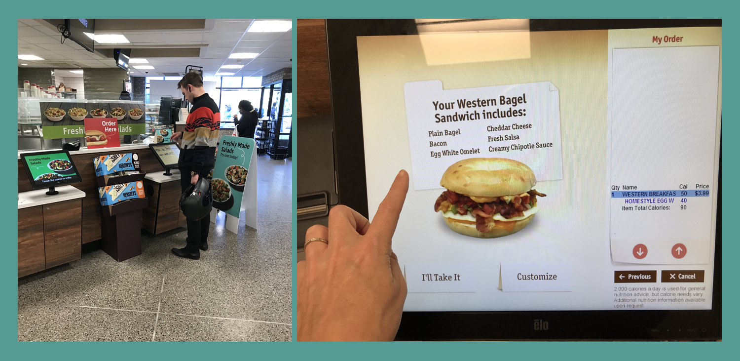
With no existing research to build from, we began by visiting a Wawa location to experience the kiosk firsthand. This included testing the full ordering process, evaluating the store environment, and observing real customer interactions. To gather quick, actionable feedback, we conducted brief interviews with users immediately after they placed their orders—capturing their thoughts while the experience was still fresh.
““Sometimes I’m really tired and I don’t want to talk to anyone. I’m happy to just place my order from the kiosk.””
Deeper Insights
To dive further into user behavior, we recruited participants familiar with Wawa kiosks through a screener survey and conducted remote contextual interviews. We built a replica of the existing kiosk interface to observe how users naturally navigated the system. This allowed us to pinpoint both what was working well and where friction occurred during the ordering experience.
“”I feel like this is confusing. I’m forced into artificial choices. I want to see all the options at once.””
Reframing the Problem
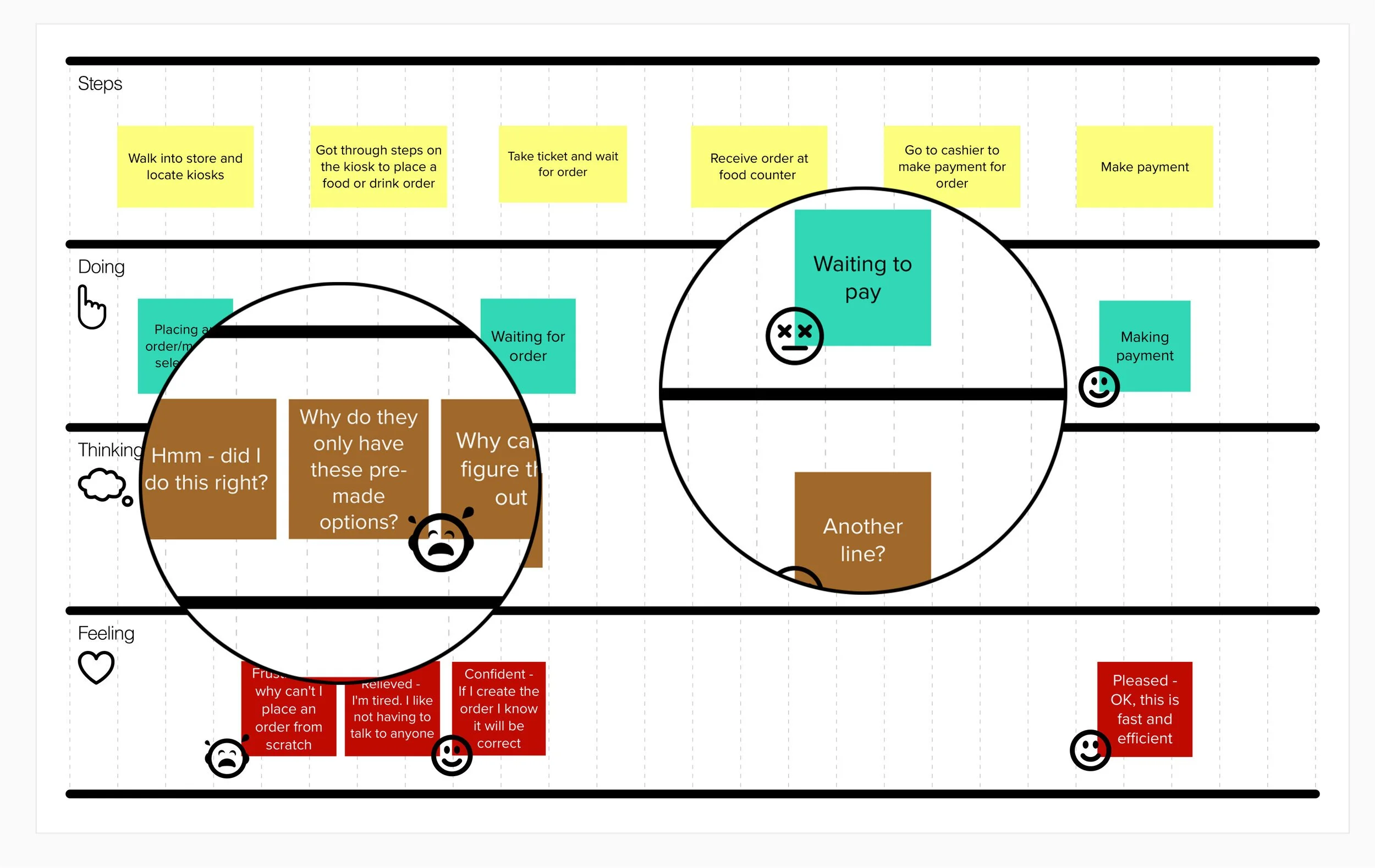
Although users were generally satisfied with the kiosk experience, key pain points emerged that were hindering usability. We distilled our research into two primary needs:
Build your own” breakfast sandwich feature to solve for ease of use and efficiency.
Pay at kiosk feature to solve for longer wait times.
While light upsell prompts (like adding bacon or a beverage) were well-received, the emphasis on pre-built sandwich options created confusion. Users often had to remove unwanted ingredients rather than start from scratch, leading to frustration. Additionally, requiring customers to pay at the counter—especially when not buying additional items—introduced unnecessary steps in an otherwise streamlined journey.
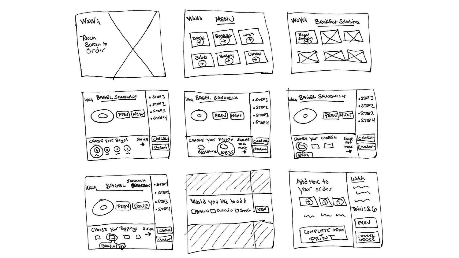
Designing an Improved Experience
The original kiosk experience made it difficult for users to easily build a custom breakfast sandwich. Our goal was to redesign the flow to reduce confusion, prevent errors, and provide clear guidance at every step. The updated interface focuses on transparency, flexibility, and a smoother path from selection to checkout.
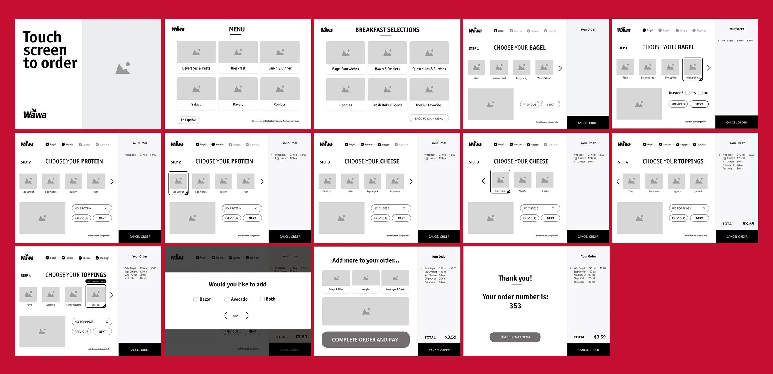
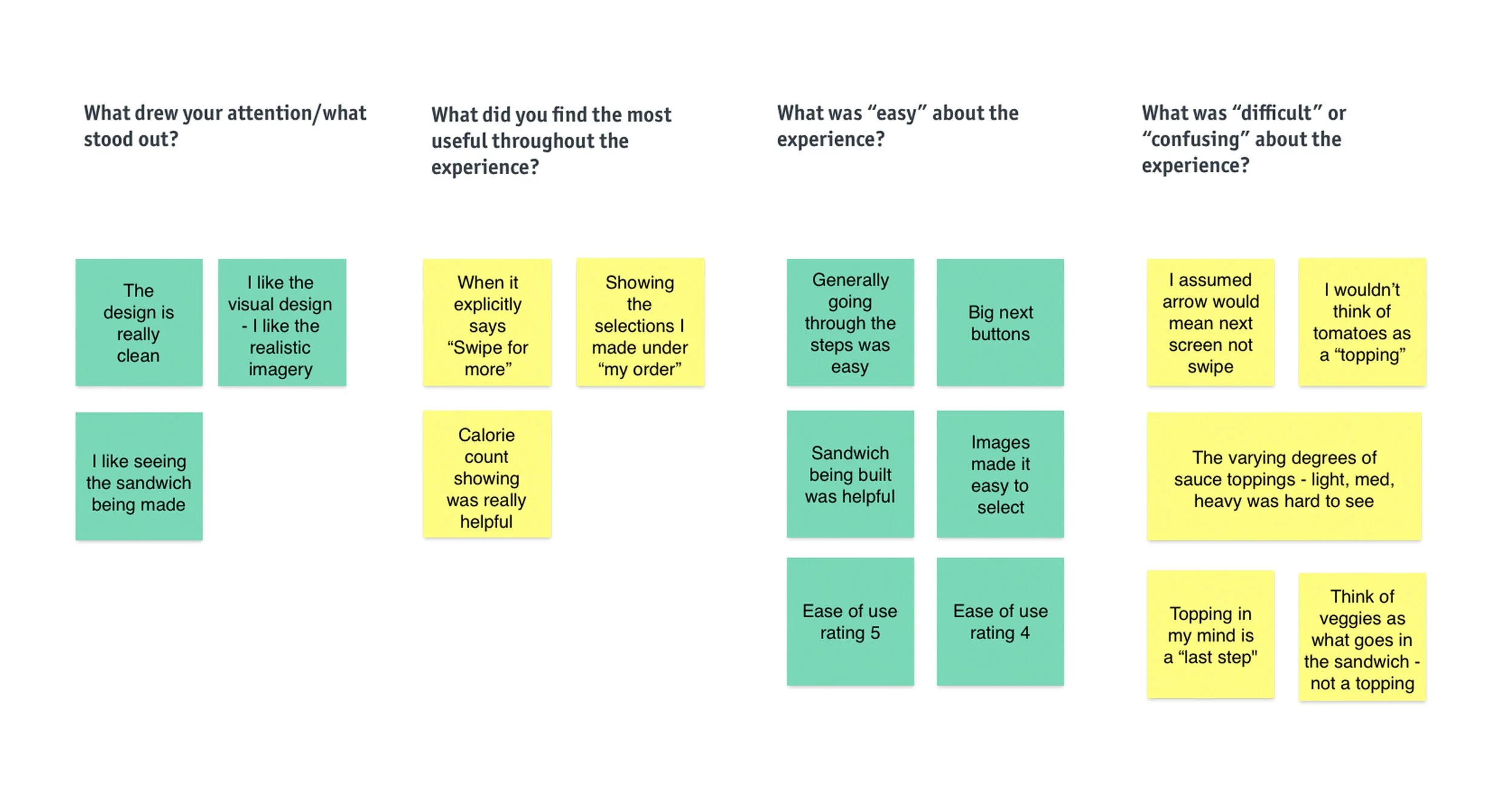
Usability Testing & Takeaways
Through iterative design, we explored ways to clarify process steps, modernize the visual language (removing outdated skeuomorphic elements), and break content into more manageable chunks. Interactive prototypes allowed us to gather valuable user feedback early and often. Usability testing revealed key pain points, leading to improvements such as simplified module flows, clearer affordances, and a redesigned approach to organizing “Toppings” and “Sauces.”

Build your own breakfast sandwich - brought to life.
The prototype below showcases the refined visual hierarchy and interactions of the kiosk. One final test was conducted to validate the design. The result is a streamlined experience that helps customers get their hoagies (and more) with fewer taps and less frustration.
Designing for Wawa’s kiosks was a rewarding challenge—balancing speed and usability for both loyal regulars and first-timers. The process reinforced the importance of aligning user experience with business efficiency and brand voice.